Разделы презентаций
- Разное
- Английский язык
- Астрономия
- Алгебра
- Биология
- География
- Геометрия
- Детские презентации
- Информатика
- История
- Литература
- Математика
- Медицина
- Менеджмент
- Музыка
- МХК
- Немецкий язык
- ОБЖ
- Обществознание
- Окружающий мир
- Педагогика
- Русский язык
- Технология
- Физика
- Философия
- Химия
- Шаблоны, картинки для презентаций
- Экология
- Экономика
- Юриспруденция
ANASTASIA LUKASHEVICH This NYC Kitchen Was Designed to Resemble an Art
Содержание
- 1. ANASTASIA LUKASHEVICH This NYC Kitchen Was Designed to Resemble an Art
- 2. Two years ago, as Diego Rincon prepared for the
- 3. AFTER: The kitchen’s elevated material palette includes Viking appliances,
- 4. The underpass on the Avenue GENERAL OSTRYAKOVABEFOREAFTER
- 5. BEFORE: The dated space “looked smaller than
- 6. Main ingredients:Cabinetry: Siena Woodworks. Upper cabinets feature high-gloss
- 7. Biggest splurge: The kitchen’s priciest feature is
- 8. Скачать презентанцию
Слайды и текст этой презентации
Слайд 2Two years ago, as Diego Rincon prepared for the gut renovation of
a client’s Chelsea kitchen, he found himself seeking inspiration from a
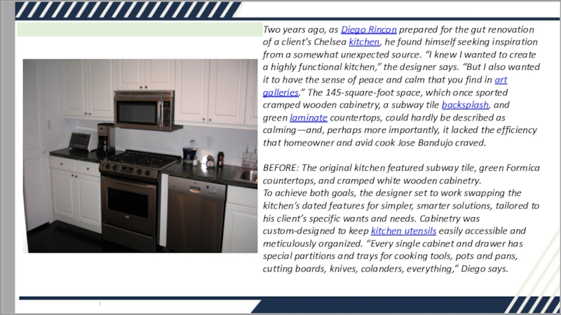
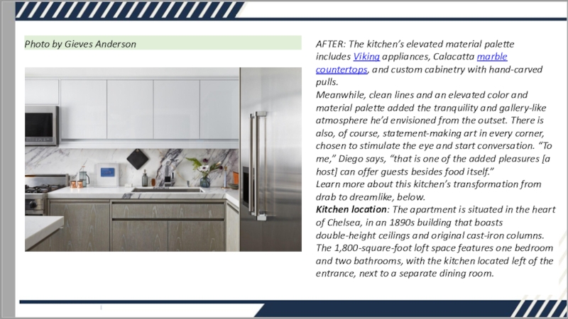
somewhat unexpected source. “I knew I wanted to create a highly functional kitchen,” the designer says. “But I also wanted it to have the sense of peace and calm that you find in art galleries.” The 145-square-foot space, which once sported cramped wooden cabinetry, a subway tile backsplash, and green laminate countertops, could hardly be described as calming—and, perhaps more importantly, it lacked the efficiency that homeowner and avid cook Jose Bandujo craved. BEFORE: The original kitchen featured subway tile, green Formica countertops, and cramped white wooden cabinetry. To achieve both goals, the designer set to work swapping the kitchen’s dated features for simpler, smarter solutions, tailored to his client’s specific wants and needs. Cabinetry was custom-designed to keep kitchen utensils easily accessible and meticulously organized. “Every single cabinet and drawer has special partitions and trays for cooking tools, pots and pans, cutting boards, knives, colanders, everything,” Diego says.Слайд 3AFTER: The kitchen’s elevated material palette includes Viking appliances, Calacatta marble countertops, and
custom cabinetry with hand-carved pulls.
Meanwhile, clean lines and an elevated
color and material palette added the tranquility and gallery-like atmosphere he’d envisioned from the outset. There is also, of course, statement-making art in every corner, chosen to stimulate the eye and start conversation. “To me,” Diego says, “that is one of the added pleasures [a host] can offer guests besides food itself.”Learn more about this kitchen’s transformation from drab to dreamlike, below.
Kitchen location: The apartment is situated in the heart of Chelsea, in an 1890s building that boasts double-height ceilings and original cast-iron columns. The 1,800-square-foot loft space features one bedroom and two bathrooms, with the kitchen located left of the entrance, next to a separate dining room.
Photo by Gieves Anderson
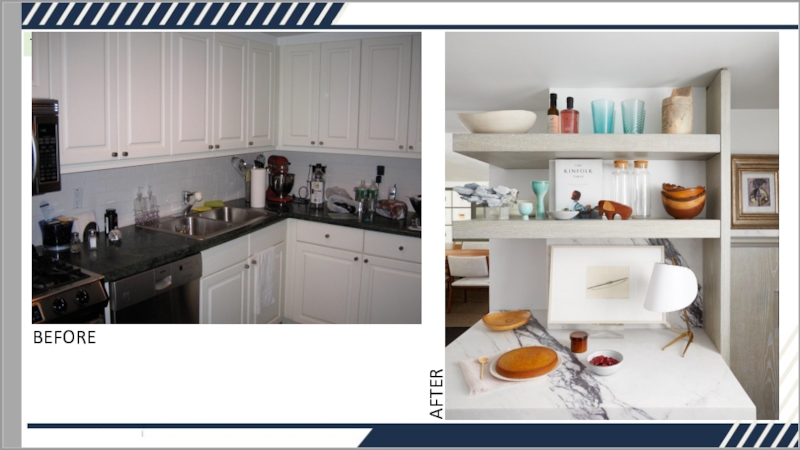
Слайд 5BEFORE: The dated space “looked smaller than it actually was,”
the designer remembers.
The before: “When I first moved in, the kitchen
was 1980s awful,” Jose says. “So I did a Home Depot–style renovation myself, to at least make it livable. It probably looked dated the day after I installed it—and, as an avid cook, it was not as functional as I would have liked.”“I love the extra-thick open shelves Diego designed,” says Jose. “I thought they’d be more decorative, but they’ve turned out to be extremely practical.” A six-inch deep spice cabinet holds a selection of herbs, oils, and vinegars.
Photo by Gieves Anderson
The inspiration: “I wanted a clean, gallery-like look,” Diego says. “Something simple and unadorned. I was influenced a lot by a book I was reading at the time about poetry and the Japanese aesthetic. The more I read, the more I was inspired by the idea of discreet elegance—and that’s what I feel best describes the design of this kitchen. The luxury is there, but it’s not jumping out at you. It’s not hurting the eye.”
Square footage: 145 square feet
Budget: For Jose, an expertly tailored space was more important than adhering to any specific budget. “I felt I’d saved enough living with a generic kitchen for over 10 years,” he says, “so I was okay not scrimping on this one.”
Слайд 6
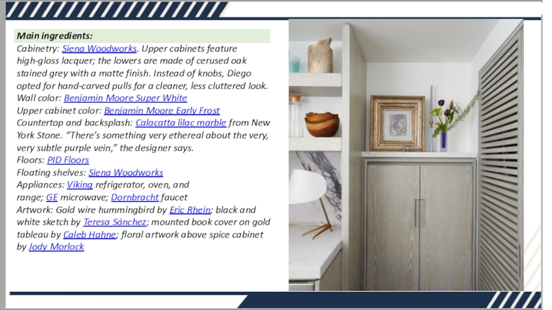
Main ingredients:
Cabinetry: Siena Woodworks. Upper cabinets feature high-gloss lacquer; the lowers
are made of cerused oak stained grey with a matte
finish. Instead of knobs, Diego opted for hand-carved pulls for a cleaner, less cluttered look. Wall color: Benjamin Moore Super White Upper cabinet color: Benjamin Moore Early Frost Countertop and backsplash: Calacatta lilac marble from New York Stone. “There’s something very ethereal about the very, very subtle purple vein,” the designer says. Floors: PID Floors Floating shelves: Siena Woodworks Appliances: Viking refrigerator, oven, and range; GE microwave; Dornbracht faucet Artwork: Gold wire hummingbird by Eric Rhein; black and white sketch by Teresa Sánchez; mounted book cover on gold tableau by Caleb Hahne; floral artwork above spice cabinet by Jody MorlockСлайд 7Biggest splurge: The kitchen’s priciest feature is its custom high-gloss
lacquered cabinetry—but for Jose, the luxury addition was worth the
expense. “Going from standard cabinets to cabinets built around my specific needs was transformative,” he says.Sneakiest save: Keeping layout changes to a minimum helped cut labor costs. “Since we didn’t have to move or change the location of most of the appliances, we were able to save quite a bit,” Diego says.
The best part: For both Jose and Diego, the Calacatta lilac marble countertop and backsplash top the list—but it’s the custom spice cabinet that attracts the most attention. “It gets the most oohs and aahs from fellow cooks,” Jose reports.
Key takeaway: “The most important question I’d tell any homeowner to ask of their designer is ‘Do you cook?’” Jose says. “Since Diego is a cook himself, he not only understood what I needed in a kitchen, he also knew what to suggest. You may not think it matters, especially if you’re not a cook, but if someone who likes to cook wants to buy your home someday—or if you become interested in cooking down the road—a functional, thoughtfully designed kitchen is a huge bonus.”
Final bill: Around $85,000
