Разделы презентаций


Theme:Presentation and protection of the main results of design activity in the

Content:1…..2 How to make a presentation?3…. Making the title (first) slide4….6 Principles of Presentation Design5….. Project presentation plan6…. Presentation Background Color7….. Presentation design

Слайды и текст этой презентации

Слайд 1Theme:Presentation and protection of the main results of design activity

in the specialty.

Prepared by:Balnur Zhaksybek.
Group: 148
Speciality:GM
Checked by:Mukhamedzhanova Asel Uzbekovna

SC «Medical university Astana»

Department of biostatistics, bioinformatics and information technologies

IWS

Theme:Presentation and protection of the main results of design activity in the specialty.

Слайд 2Content:
1…..2 How to make a presentation?
3…. Making the title (first)

slide
4….6 Principles of Presentation Design
5….. Project presentation plan
6…. Presentation Background

Color
7….. Presentation design


Content:1…..2 How to make a presentation?3…. Making the title (first) slide4….6 Principles of Presentation Design5….. Project presentation

Слайд 3How to make a presentation? No matter what the purpose of

your presentation is, it can be: Protection of abstract, term paper

or thesis; Report on events or achievements; Product OverviewAdvertising company.For any task, the basic principles of proper presentation design are always the same!
How to make a presentation?  No matter what the purpose of your presentation is, it can

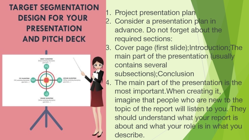
Слайд 4Project presentation plan
Consider a presentation plan in advance. Do

not forget about the required sections:
Cover page (first slide);Introduction;The main

part of the presentation (usually contains several subsections);Conclusion
The main part of the presentation is the most important.When creating it, imagine that people who are new to the topic of the report will listen to you. They should understand what your report is about and what your role is in what you describe.
Project presentation plan Consider a presentation plan in advance. Do not forget about the required sections:Cover page

Слайд 5Making the title (first) slide
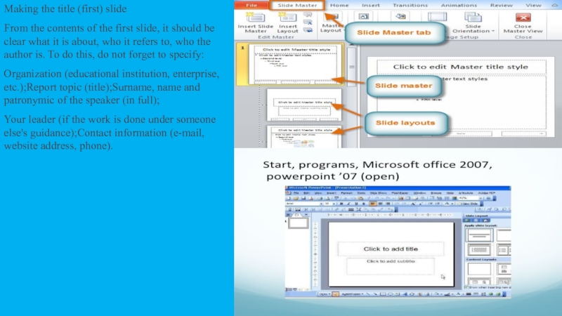
From the contents of the first

slide, it should be clear what it is about, who

it refers to, who the author is. To do this, do not forget to specify:
Organization (educational institution, enterprise, etc.);Report topic (title);Surname, name and patronymic of the speaker (in full);
Your leader (if the work is done under someone else's guidance);Contact information (e-mail, website address, phone).
Making the title (first) slideFrom the contents of the first slide, it should be clear what it

Слайд 6The 4 Basic Principles of Presentation Design

The 4 Basic Principles of Presentation Design

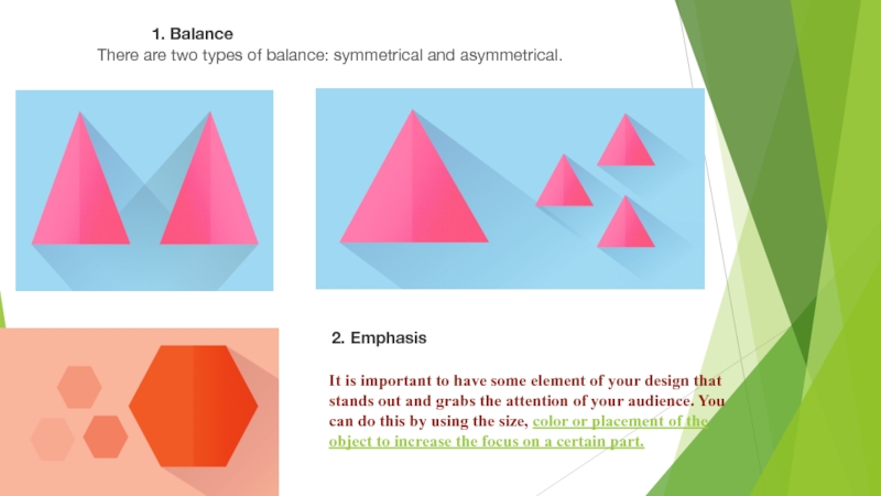
Слайд 71. Balance
There are two types of balance: symmetrical and asymmetrical.
2.

Emphasis
It is important to have some element of your design

that stands out and grabs the attention of your audience. You can do this by using the size, color or placement of the object to increase the focus on a certain part.
1. BalanceThere are two types of balance: symmetrical and asymmetrical.2. EmphasisIt is important to have some element

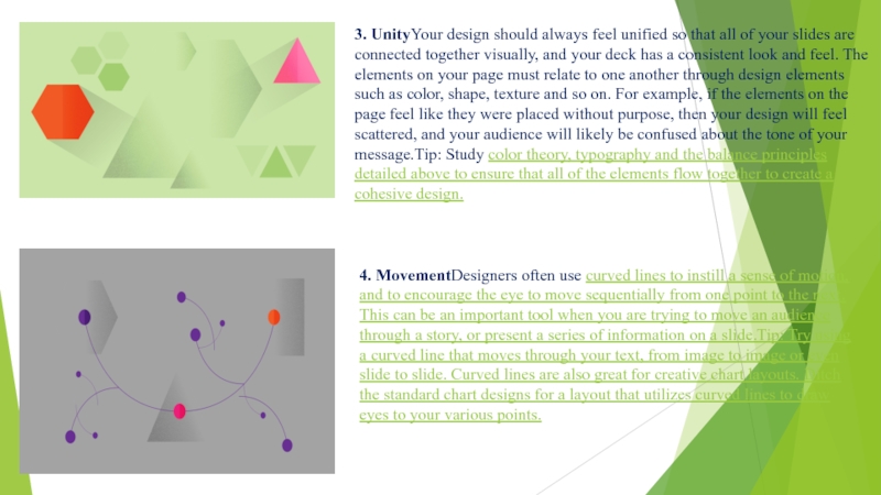
Слайд 83. UnityYour design should always feel unified so that all

of your slides are connected together visually, and your deck

has a consistent look and feel. The elements on your page must relate to one another through design elements such as color, shape, texture and so on. For example, if the elements on the page feel like they were placed without purpose, then your design will feel scattered, and your audience will likely be confused about the tone of your message.Tip: Study color theory, typography and the balance principles detailed above to ensure that all of the elements flow together to create a cohesive design.

4. MovementDesigners often use curved lines to instill a sense of motion, and to encourage the eye to move sequentially from one point to the next. This can be an important tool when you are trying to move an audience through a story, or present a series of information on a slide.Tip: Try using a curved line that moves through your text, from image to image or even slide to slide. Curved lines are also great for creative chart layouts. Ditch the standard chart designs for a layout that utilizes curved lines to draw eyes to your various points.

3. UnityYour design should always feel unified so that all of your slides are connected together visually,

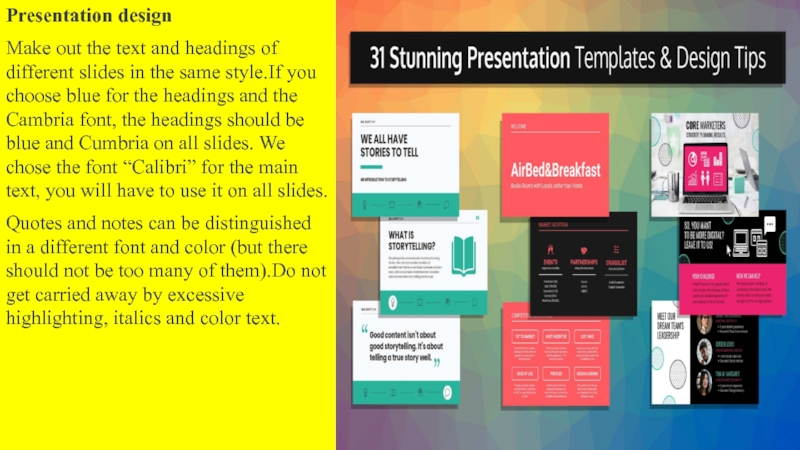
Слайд 9Presentation design
Make out the text and headings of different slides

in the same style.If you choose blue for the headings

and the Cambria font, the headings should be blue and Cumbria on all slides. We chose the font “Calibri” for the main text, you will have to use it on all slides.
Quotes and notes can be distinguished in a different font and color (but there should not be too many of them).Do not get carried away by excessive highlighting, italics and color text.
Presentation designMake out the text and headings of different slides in the same style.If you choose blue

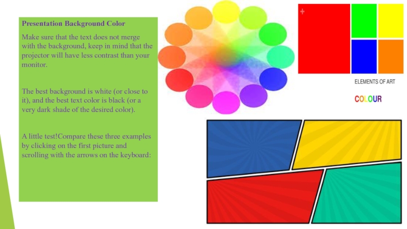
Слайд 10Presentation Background Color
Make sure that the text does not merge

with the background, keep in mind that the projector will

have less contrast than your monitor.

The best background is white (or close to it), and the best text color is black (or a very dark shade of the desired color).

A little test!Compare these three examples by clicking on the first picture and scrolling with the arrows on the keyboard:
Presentation Background ColorMake sure that the text does not merge with the background, keep in mind that

Обратная связь

Если не удалось найти и скачать доклад-презентацию, Вы можете заказать его на нашем сайте. Мы постараемся найти нужный Вам материал и отправим по электронной почте. Не стесняйтесь обращаться к нам, если у вас возникли вопросы или пожелания:

Email: Нажмите что бы посмотреть 

Что такое TheSlide.ru?

Это сайт презентации, докладов, проектов в PowerPoint. Здесь удобно  хранить и делиться своими презентациями с другими пользователями.


Для правообладателей

Яндекс.Метрика